SRA Results
The results on this page are based on 256 SRA datasets. After preprocessing each dataset using lenient filters in order to keep data for as many genes and samples as possible, we compared methods commonly used in RNA-seq analysis to effectively construct one coexpression network per dataset (i.e. building 256 SRA networks).
Key stages of data processing and network building tested here: 1. Within-sample normalization: counts per million (CPM), transcripts per million (TPM), and reads per kilobase per million (RPKM), 2. Between-sample normalization: quantile (QNT), trimmed mean of M-values (TMM), and upper quartile (UQ), and 3. Network transformation: weighted topological overlap (WTO) and context likelihood of relatedness (CLR).
Individual methods are in regular font (e.g. TPM normalization) and workflows are italicized (e.g. TPM, which TPM combined with no between-sample normalization and no network transformation, or TPM_CLR, which is TPM paired with just CLR).
The evaluation metrics are:
Log2(auPRC/prior); auPRC is the area under the Precision-Recall Curve, prior is the expected auPRC from a random classifier. Focus on this metric to pick the workflow that results in an overall high-quality coexpression network.
auROC; area under the ROC Curve. This commonly-used metric also points to overall quality of the network but is not well-suited for imbalanced problems such as predicting gene functional relationships. We include this metric here for completion.
Log2(p20r/prior); p20r is precision at 20% recall. Focus on this metric if you are interested in applying a threshold to the coexpression network and select high-scoring gene pairs for some subsequent analysis.
The evaluations are based on:
Naive standard: Experimentally-verified gene co-annotations to specific Biological Process terms in the Gene Ontology, and
Tissue-aware standard: The naive gold standard subset by genes known to be expressed in a given tissue.
Data
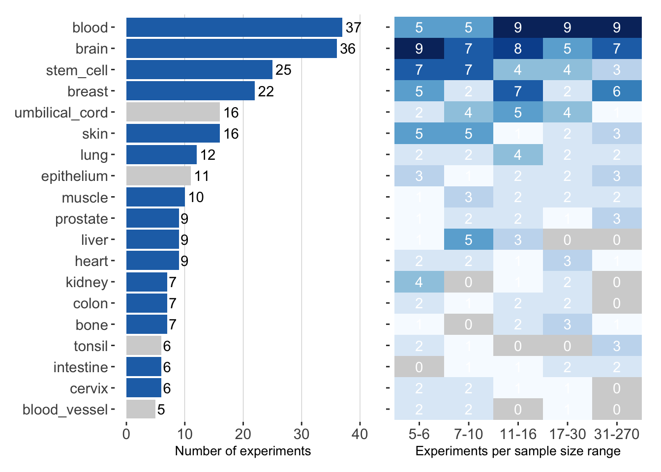
Data. The barplot shows the number of experiments from each tissue in the SRA data. Blue bars indicate tissues for which we were able to create a tissue-aware gold standard. Tissues with gray bars were evaluated on the tissue-naive standard only. The heatmap on the right shows the number of projects/experiments that have a particular sample size for each tissue.
Overall Method Performance
log2(auPRC/prior)
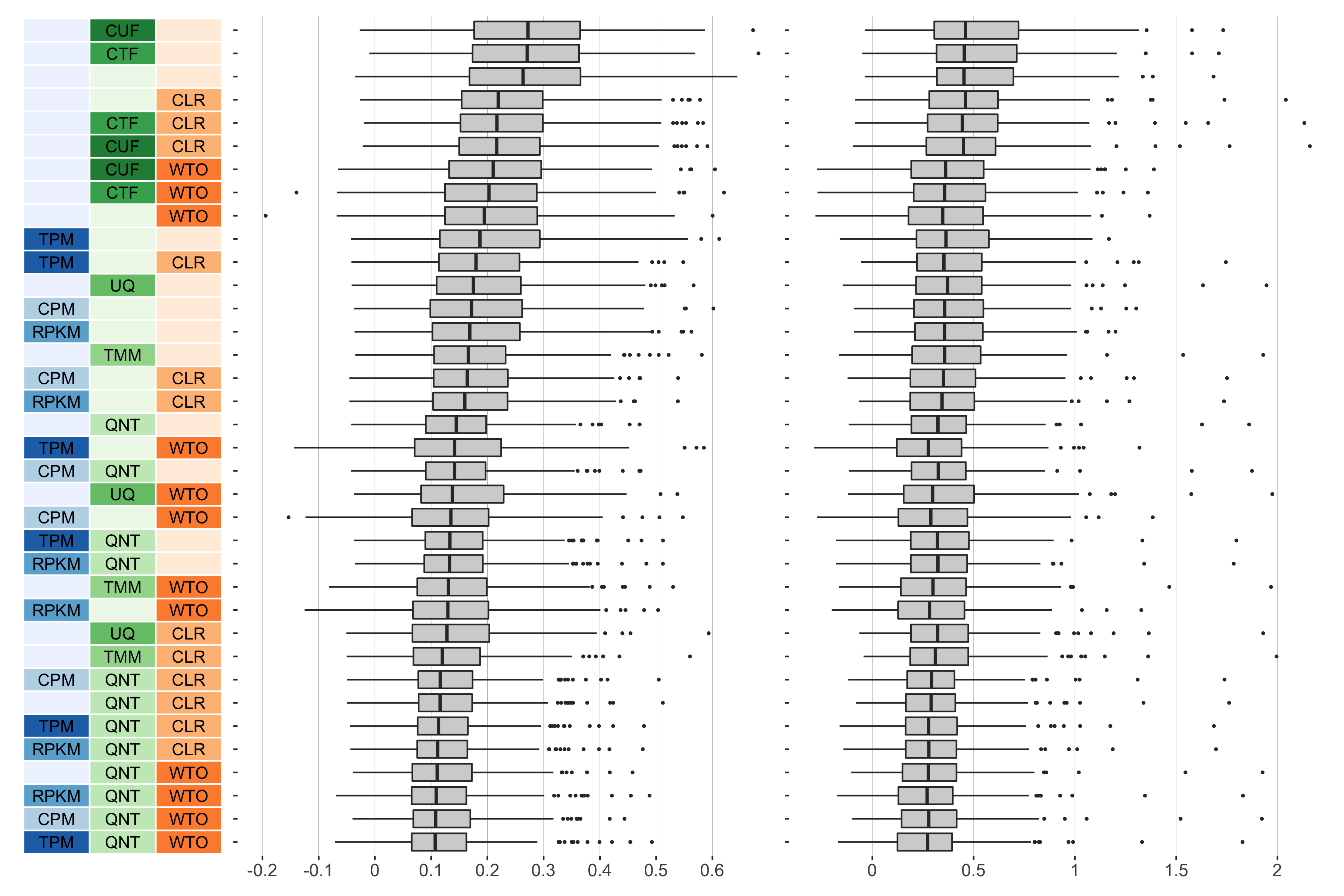
Overall performance of workflows. The plots show the aggregate accuracy of all SRA coexpression networks resulting from each individual workflow evaluated using the (left) tissue-naive and (right) tissue-aware gold standards. The workflows (rows) are described in terms of the specific method used in the within-sample normalization (blues), between-sample normalization (greens), and network transformation (oranges) stages. The performance of each workflow is presented as boxplots that summarizes the log2(auPRC/prior) of each workflow where auPRC is the area under the precision recall curve. The workflows are ordered by their median log2(auPRC/prior) for the tissue-naive data.
auROC
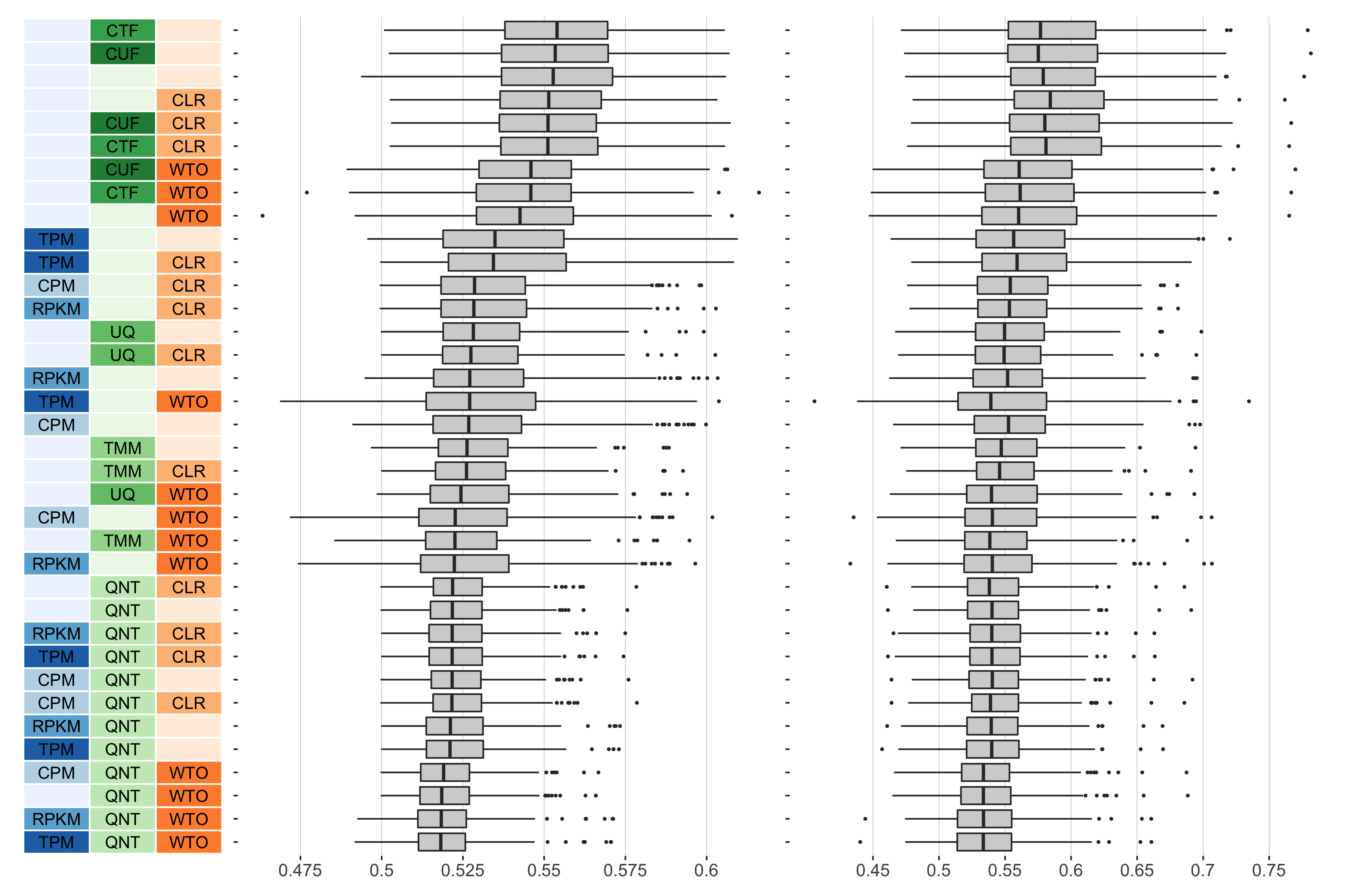
Overall performance of workflows. The plots show the aggregate accuracy of all SRA coexpression networks resulting from each individual workflow evaluated using the (left) tissue-naive and (right) tissue-aware gold standards. The workflows (rows) are described in terms of the specific method used in the within-sample normalization (blues), between-sample normalization (greens), and network transformation (oranges) stages. The performance of each workflow is presented as boxplots that summarizes the auROC of each workflow where auPRC is the area under the precision recall curve. The workflows are ordered by their median auROC for the tissue-naive data.
log2(p20r/prior)
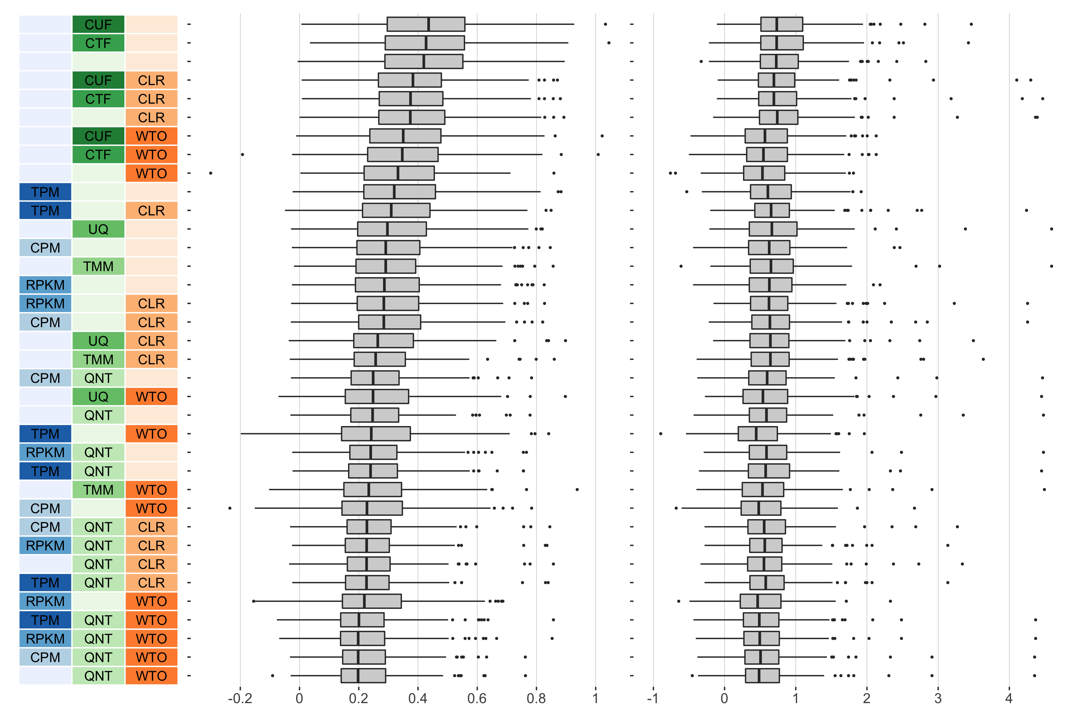
Overall performance of workflows. The plots show the aggregate accuracy of all SRA coexpression networks resulting from each individual workflow evaluated using the (left) tissue-naive and (right) tissue-aware gold standards. The workflows (rows) are described in terms of the specific method used in the within-sample normalization (blues), between-sample normalization (greens), and network transformation (oranges) stages. The performance of each workflow is presented as boxplots that summarizes the log2(p20r/prior) of each workflow where auPRC is the area under the precision recall curve. The workflows are ordered by their median log2(p20r/prior) for the tissue-naive data.
Proportion of Times Each Method Outperforms Another
log2(auPRC/prior)
Tissue-naive Standard

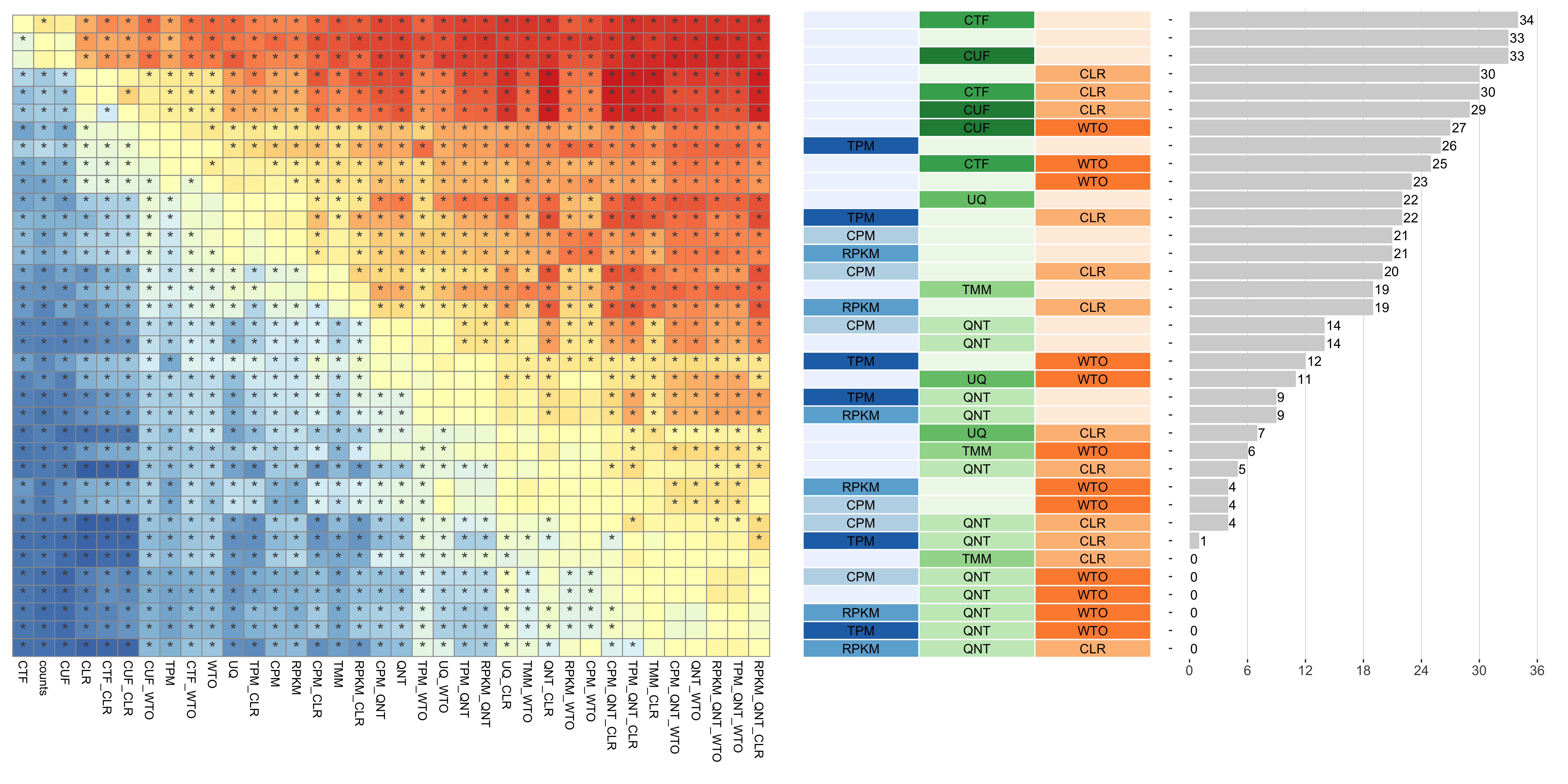
Dataset-level pairwise comparison of workflow performance. (left) The heatmap shows the relative performance of a pair of workflows, corresponding to a row and a column, directly compared to each other for the SRA datasets based on the tissue-naive gold standard. The color in each cell (row, column) represents the proportion of datasets for which the workflow along the row has a higher log2(auPRC/prior) than the workflow along the column. Comparisons that are statistically significant (corrected p < 0.01) based on a paired Wilcoxon test are marked with an asterisk. (middle) The workflows (rows) are described in terms of the specific method used in the within-sample normalization (blues), between-sample normalization (greens), and network transformation (oranges) stages. (right) The barplot shows the number of times each workflow was significantly greater than another workflow.
Tissue-aware Standard
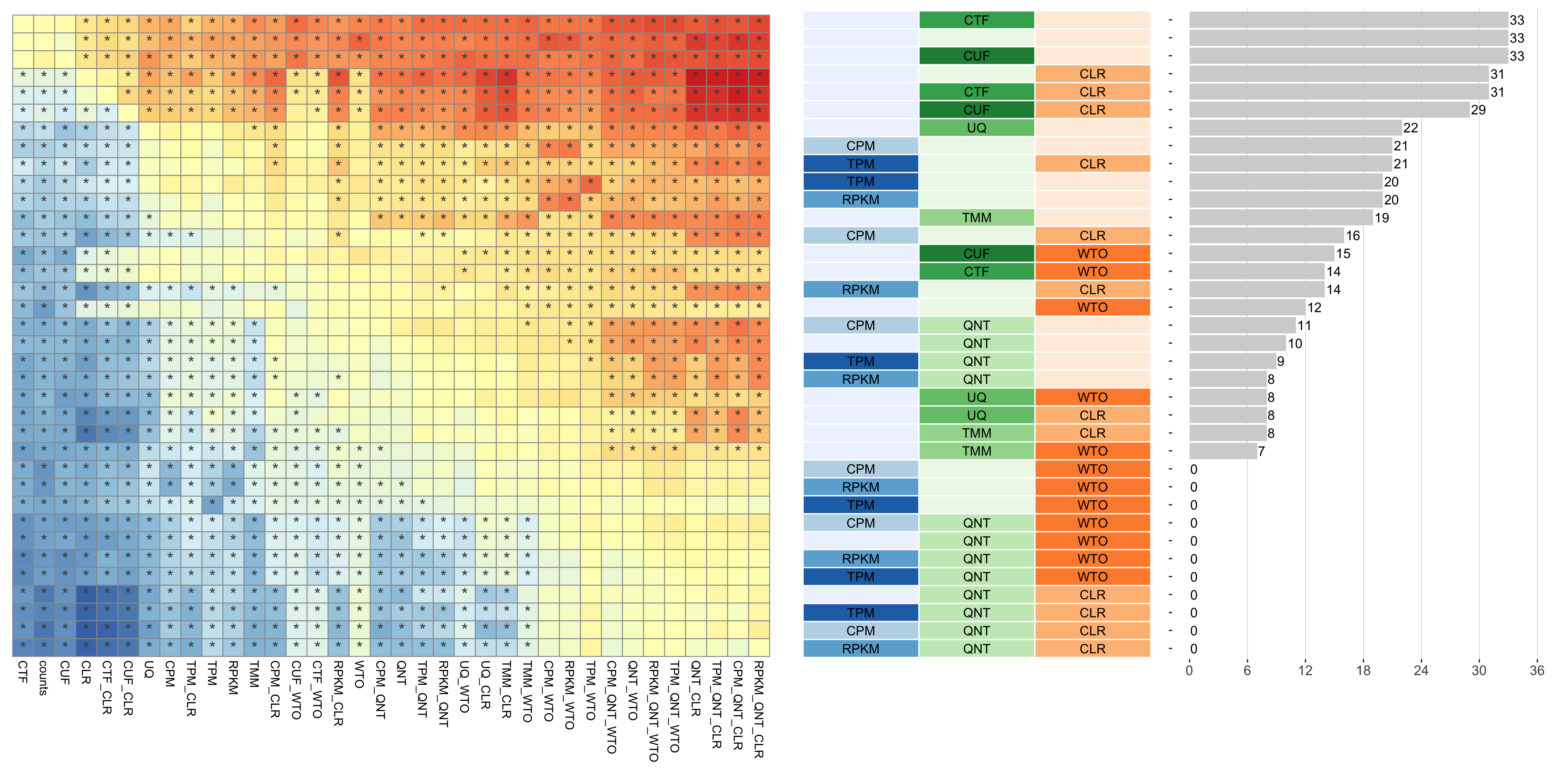
Dataset-level pairwise comparison of workflow performance. (left) The heatmap shows the relative performance of a pair of workflows, corresponding to a row and a column, directly compared to each other for the SRA datasets based on the tissue-aware gold standard. The color in each cell (row, column) represents the proportion of datasets for which the workflow along the row has a higher log2(auPRC/prior) than the workflow along the column. Comparisons that are statistically significant (corrected p < 0.01) based on a paired Wilcoxon test are marked with an asterisk. (middle) The workflows (rows) are described in terms of the specific method used in the within-sample normalization (blues), between-sample normalization (greens), and network transformation (oranges) stages. (right) The barplot shows the number of times each workflow was significantly greater than another workflow.
auROC
Tissue-naive Standard
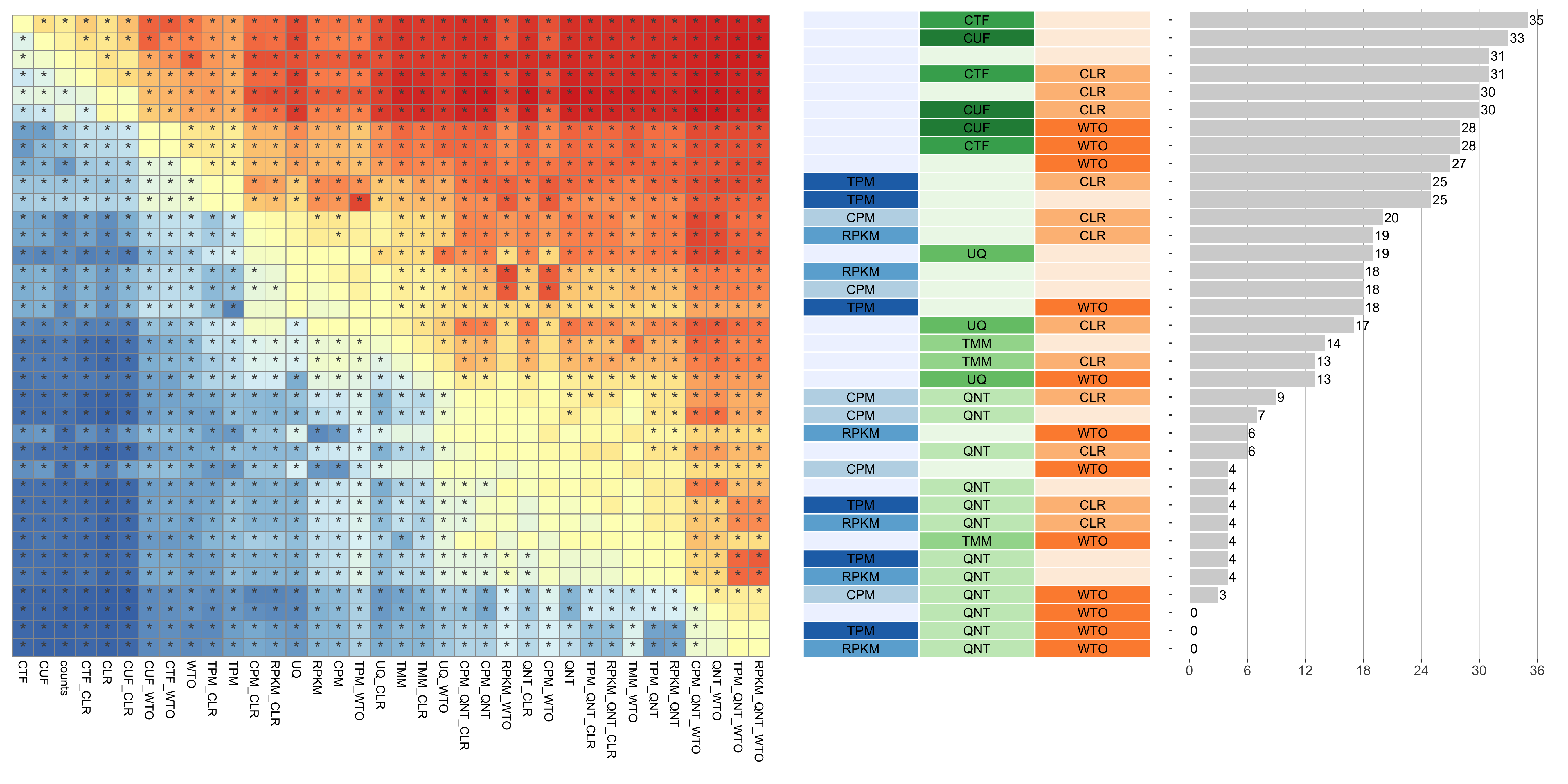
Dataset-level pairwise comparison of workflow performance. (left) The heatmap shows the relative performance of a pair of workflows, corresponding to a row and a column, directly compared to each other for the SRA datasets based on the tissue-naive gold standard. The color in each cell (row, column) represents the proportion of datasets for which the workflow along the row has a higher auROC than the workflow along the column. Comparisons that are statistically significant (corrected p < 0.01) based on a paired Wilcoxon test are marked with an asterisk. (middle) The workflows (rows) are described in terms of the specific method used in the within-sample normalization (blues), between-sample normalization (greens), and network transformation (oranges) stages. (right) The barplot shows the number of times each workflow was significantly greater than another workflow.
Tissue-aware Standard
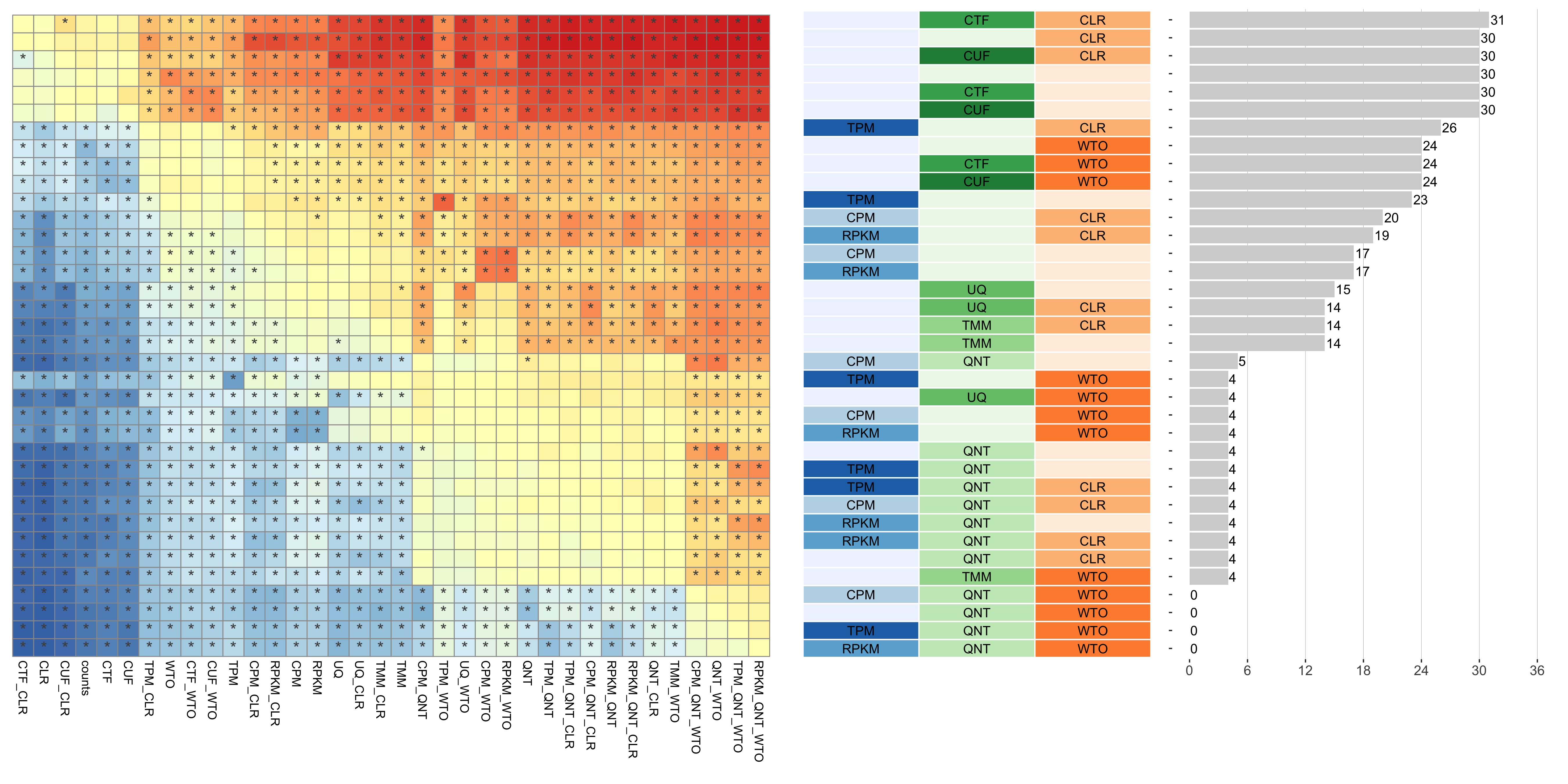
Dataset-level pairwise comparison of workflow performance. (left) The heatmap shows the relative performance of a pair of workflows, corresponding to a row and a column, directly compared to each other for the SRA datasets based on the tissue-aware gold standard. The color in each cell (row, column) represents the proportion of datasets for which the workflow along the row has a higher auROC than the workflow along the column. Comparisons that are statistically significant (corrected p < 0.01) based on a paired Wilcoxon test are marked with an asterisk. (middle) The workflows (rows) are described in terms of the specific method used in the within-sample normalization (blues), between-sample normalization (greens), and network transformation (oranges) stages. (right) The barplot shows the number of times each workflow was significantly greater than another workflow.
log2(p20r/prior)
Tissue-naive Standard
Dataset-level pairwise comparison of workflow performance. (left) The heatmap shows the relative performance of a pair of workflows, corresponding to a row and a column, directly compared to each other for the SRA datasets based on the tissue-naive gold standard. The color in each cell (row, column) represents the proportion of datasets for which the workflow along the row has a higher log2(p20r/prior) than the workflow along the column. Comparisons that are statistically significant (corrected p < 0.01) based on a paired Wilcoxon test are marked with an asterisk. (middle) The workflows (rows) are described in terms of the specific method used in the within-sample normalization (blues), between-sample normalization (greens), and network transformation (oranges) stages. (right) The barplot shows the number of times each workflow was significantly greater than another workflow.
Tissue-aware Standard
Dataset-level pairwise comparison of workflow performance. (left) The heatmap shows the relative performance of a pair of workflows, corresponding to a row and a column, directly compared to each other for the SRA datasets based on the tissue-aware gold standard. The color in each cell (row, column) represents the proportion of datasets for which the workflow along the row has a higher log2(p20r/prior) than the workflow along the column. Comparisons that are statistically significant (corrected p < 0.01) based on a paired Wilcoxon test are marked with an asterisk. (middle) The workflows (rows) are described in terms of the specific method used in the within-sample normalization (blues), between-sample normalization (greens), and network transformation (oranges) stages. (right) The barplot shows the number of times each workflow was significantly greater than another workflow.
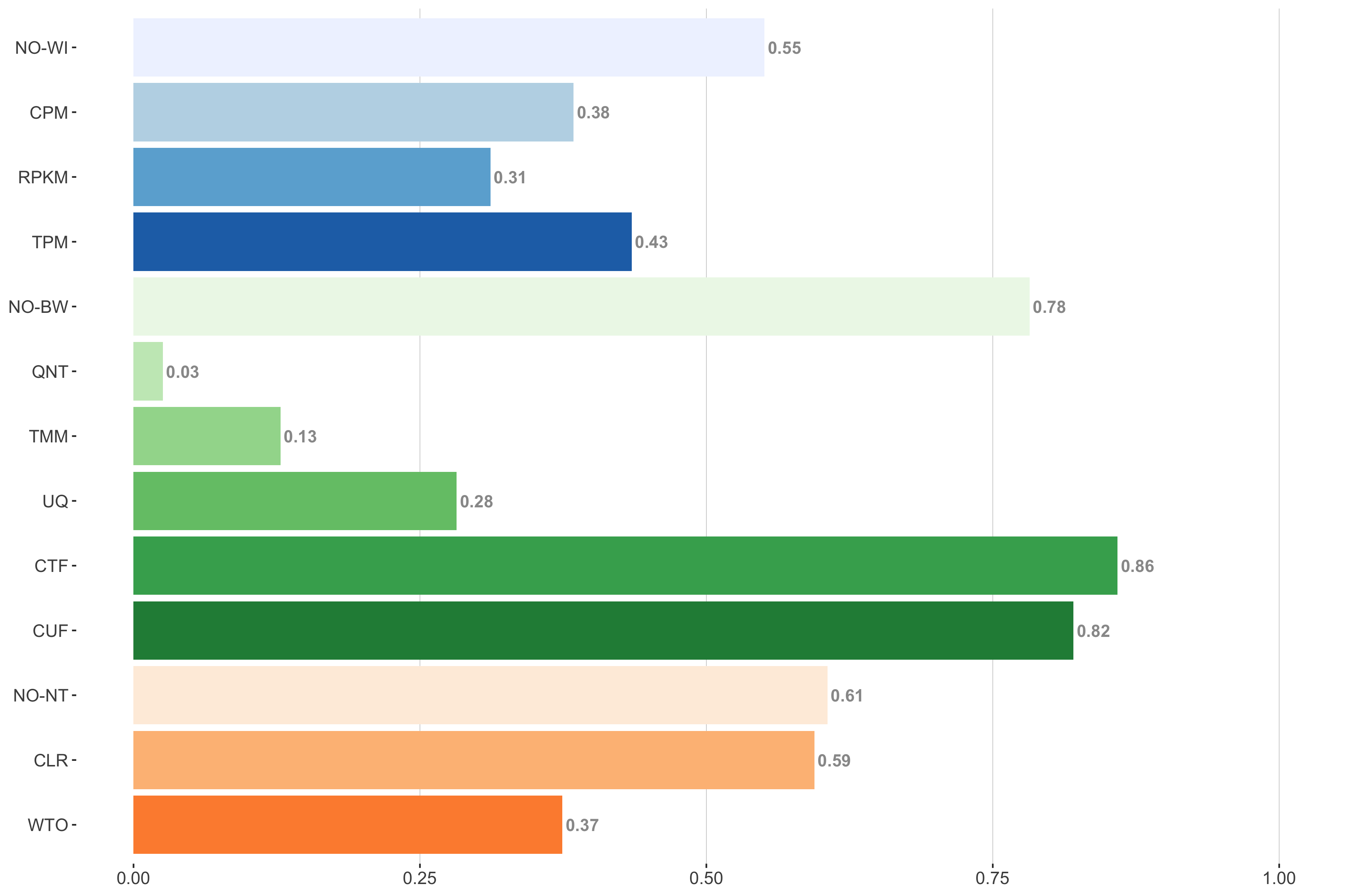
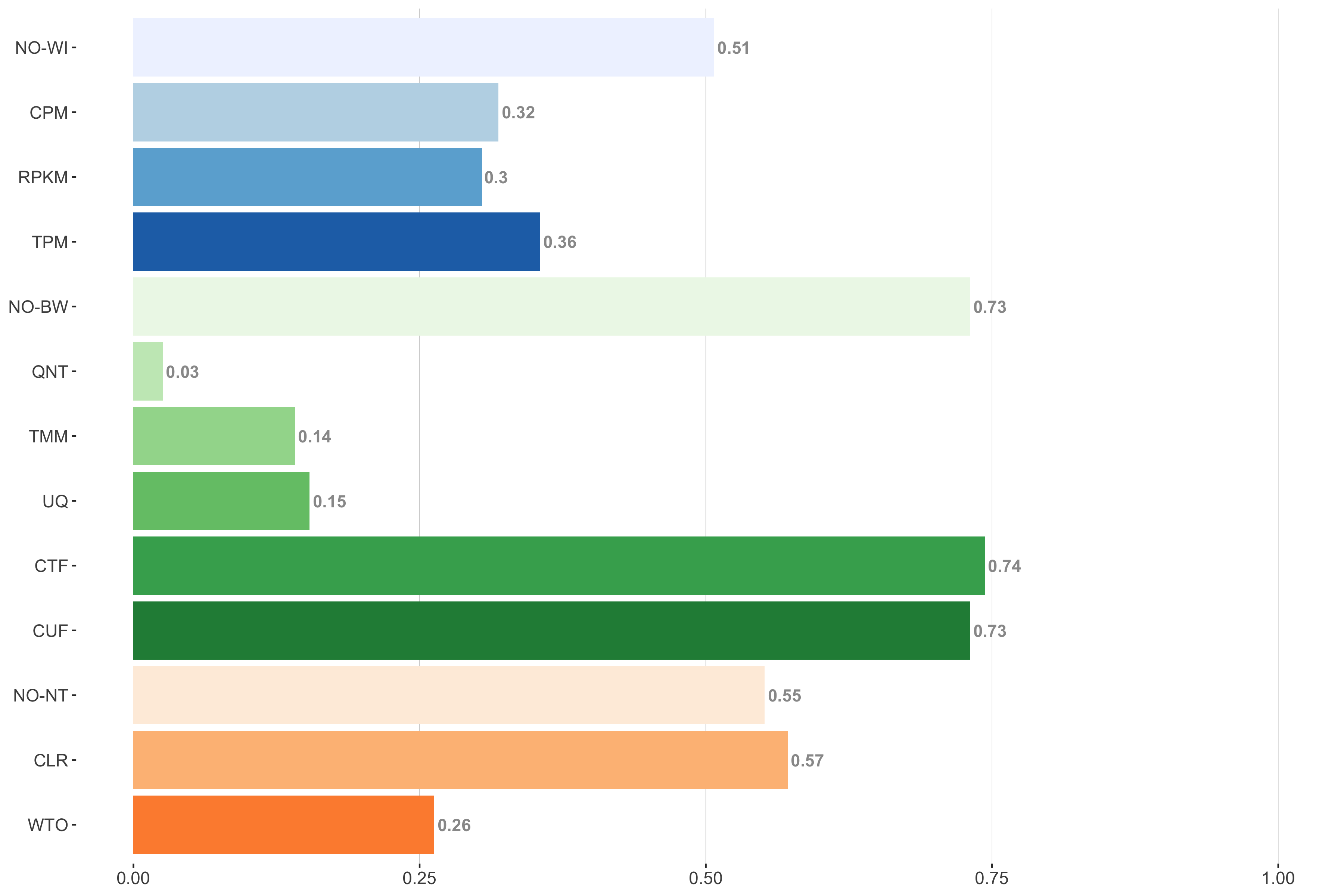
Method Part Comparison
log2(auPRC/prior)
Tissue-naive Standard
Impact of individual methods on performance of workflows. Each bar in the barplot corresponds to a specific method, showing the proportion of times (x-axis) that workflows including that particular method (y-axis) were significantly better than other workflows. In order to make the comparison of between-sample normalization methods fair, workflows also including CPM, RPKM, or TPM were left out because it is not possible to pair them with TMM or UQ normalization. Similarly, TMM and UQ methods are not included for “no within-sample normalization” (NO–WI).
Tissue-aware Standard
Impact of individual methods on performance of workflows. Each bar in the barplot corresponds to a specific method, showing the proportion of times (x-axis) that workflows including that particular method (y-axis) were significantly better than other workflows. In order to make the comparison of between-sample normalization methods fair, workflows also including CPM, RPKM, or TPM were left out because it is not possible to pair them with TMM or UQ normalization. Similarly, TMM and UQ methods are not included for “no within-sample normalization” (NO–WI).
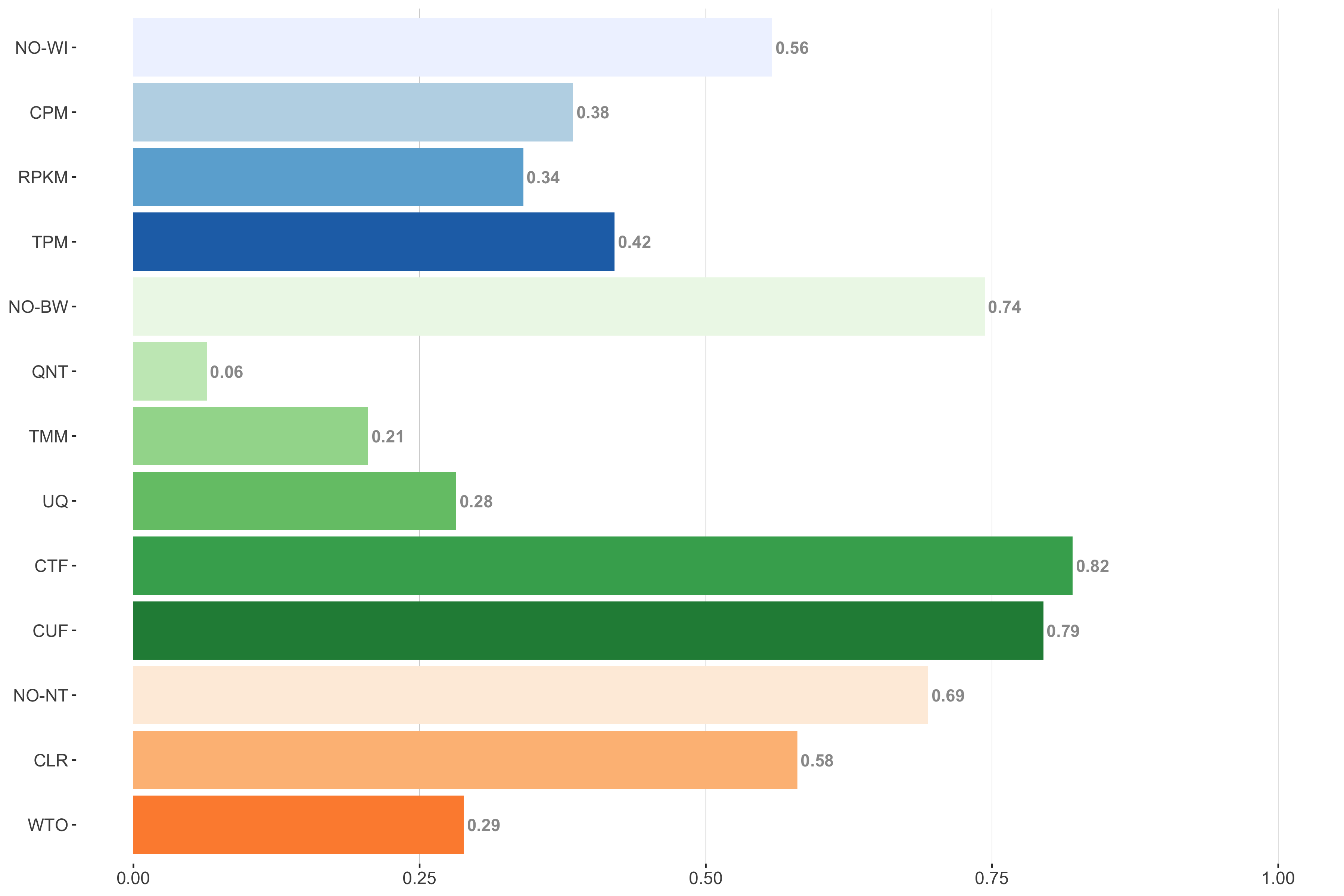
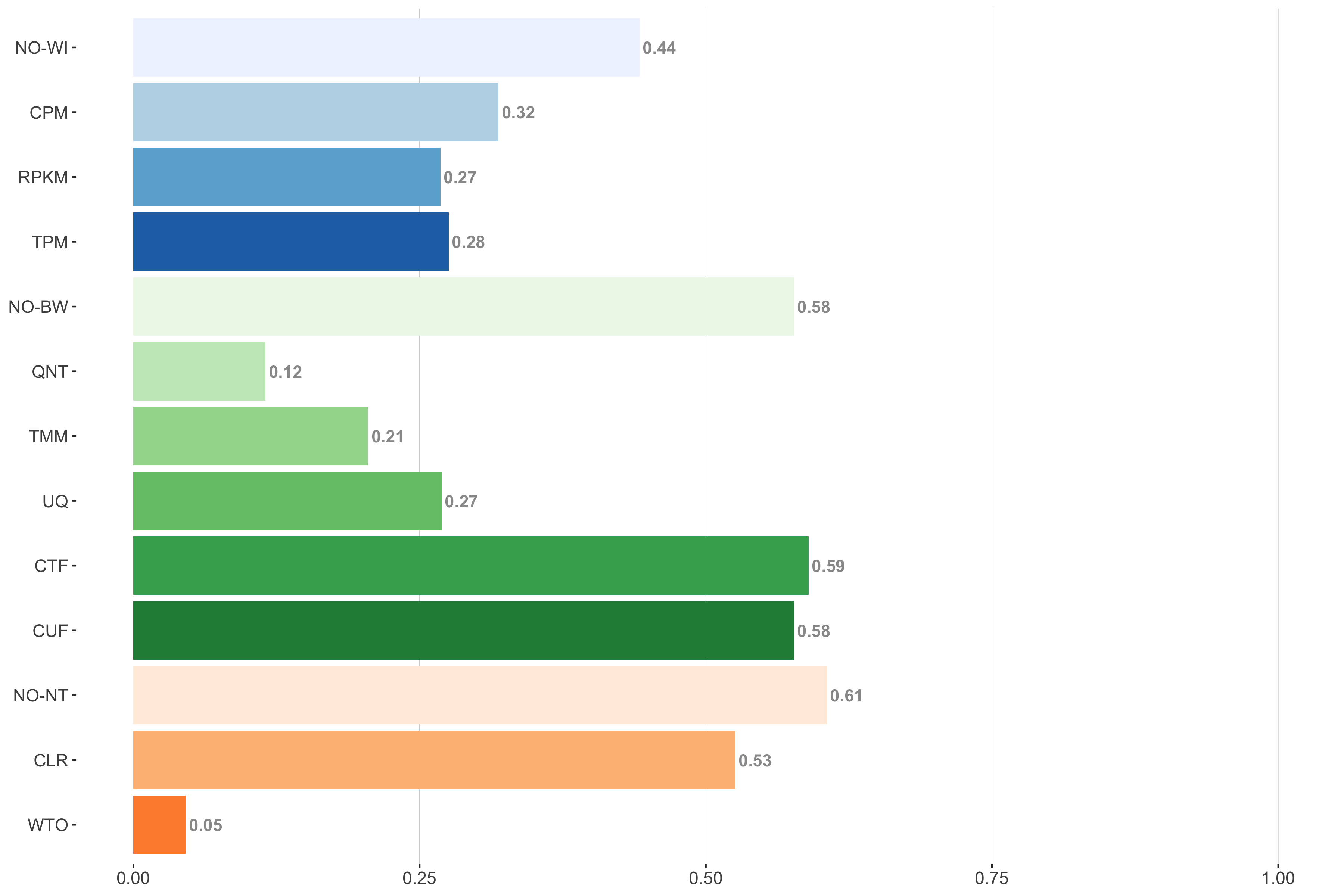
auROC
Tissue-naive Standard
Impact of individual methods on performance of workflows. Each bar in the barplot corresponds to a specific method, showing the proportion of times (x-axis) that workflows including that particular method (y-axis) were significantly better than other workflows. In order to make the comparison of between-sample normalization methods fair, workflows also including CPM, RPKM, or TPM were left out because it is not possible to pair them with TMM or UQ normalization. Similarly, TMM and UQ methods are not included for “no within-sample normalization” (NO–WI).
Tissue-aware Standard
Impact of individual methods on performance of workflows. Each bar in the barplot corresponds to a specific method, showing the proportion of times (x-axis) that workflows including that particular method (y-axis) were significantly better than other workflows. In order to make the comparison of between-sample normalization methods fair, workflows also including CPM, RPKM, or TPM were left out because it is not possible to pair them with TMM or UQ normalization. Similarly, TMM and UQ methods are not included for “no within-sample normalization” (NO–WI).
log2(p20r/prior)
Tissue-naive Standard
Impact of individual methods on performance of workflows. Each bar in the barplot corresponds to a specific method, showing the proportion of times (x-axis) that workflows including that particular method (y-axis) were significantly better than other workflows. In order to make the comparison of between-sample normalization methods fair, workflows also including CPM, RPKM, or TPM were left out because it is not possible to pair them with TMM or UQ normalization. Similarly, TMM and UQ methods are not included for “no within-sample normalization” (NO–WI).
Tissue-aware Standard
Impact of individual methods on performance of workflows. Each bar in the barplot corresponds to a specific method, showing the proportion of times (x-axis) that workflows including that particular method (y-axis) were significantly better than other workflows. In order to make the comparison of between-sample normalization methods fair, workflows also including CPM, RPKM, or TPM were left out because it is not possible to pair them with TMM or UQ normalization. Similarly, TMM and UQ methods are not included for “no within-sample normalization” (NO–WI).
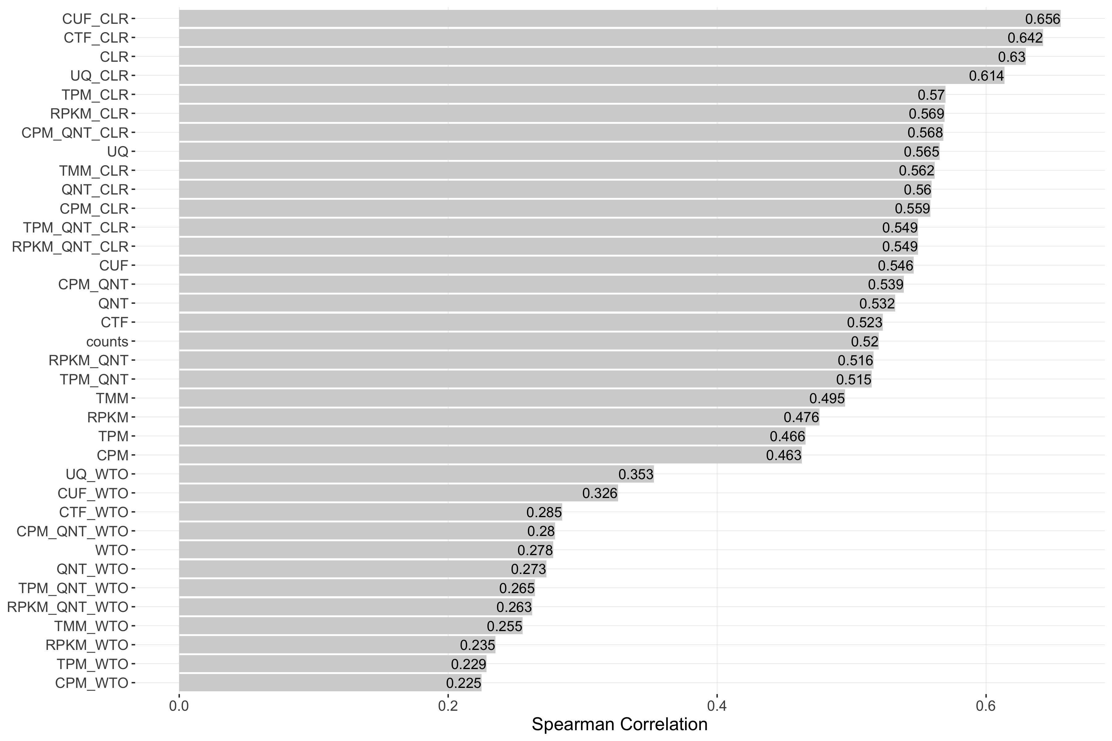
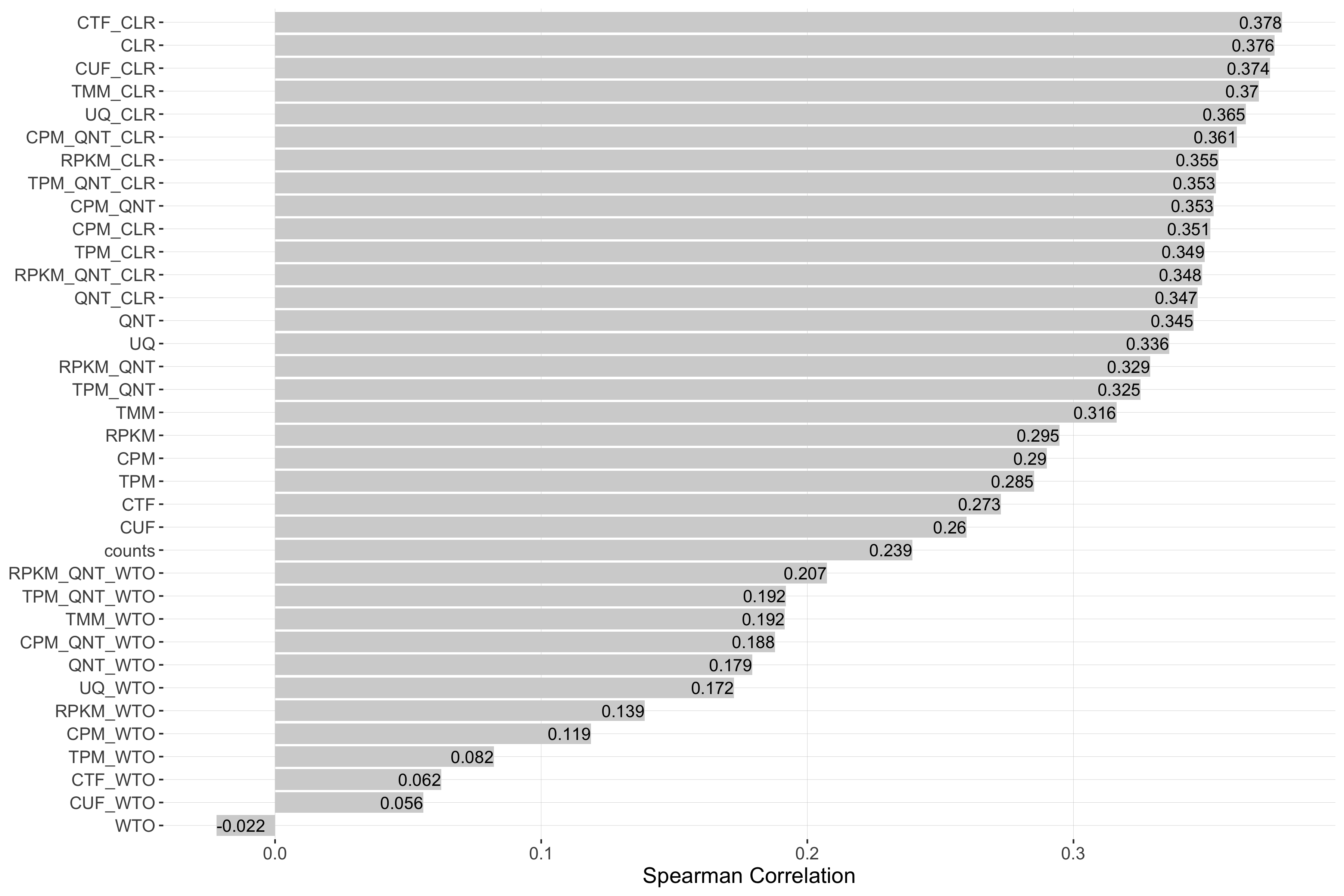
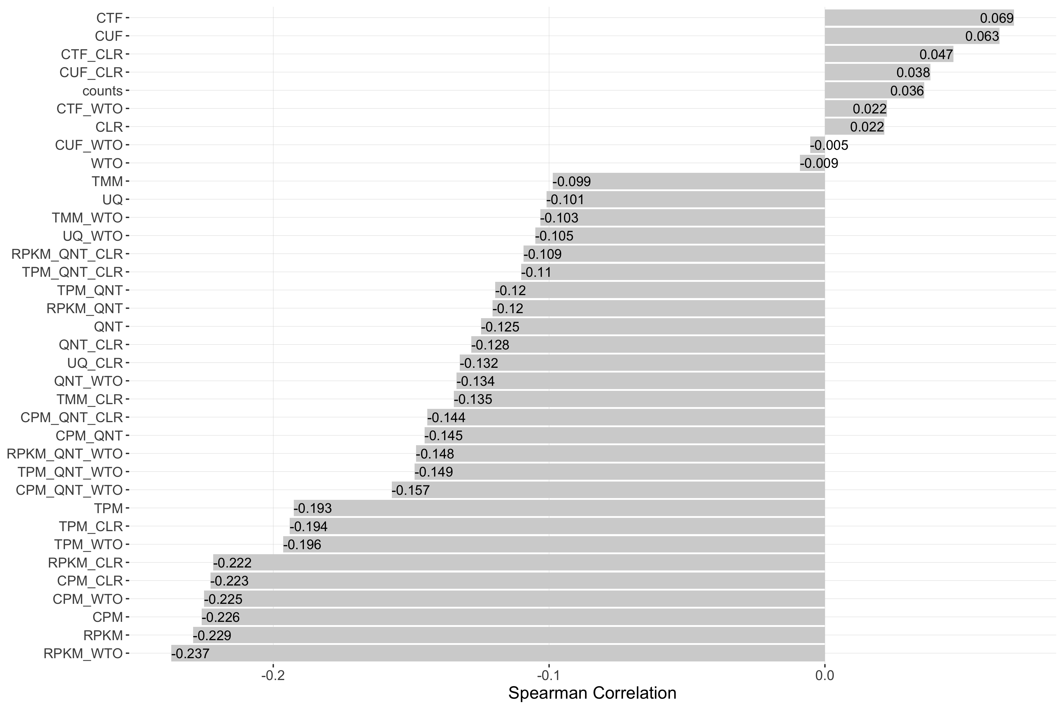
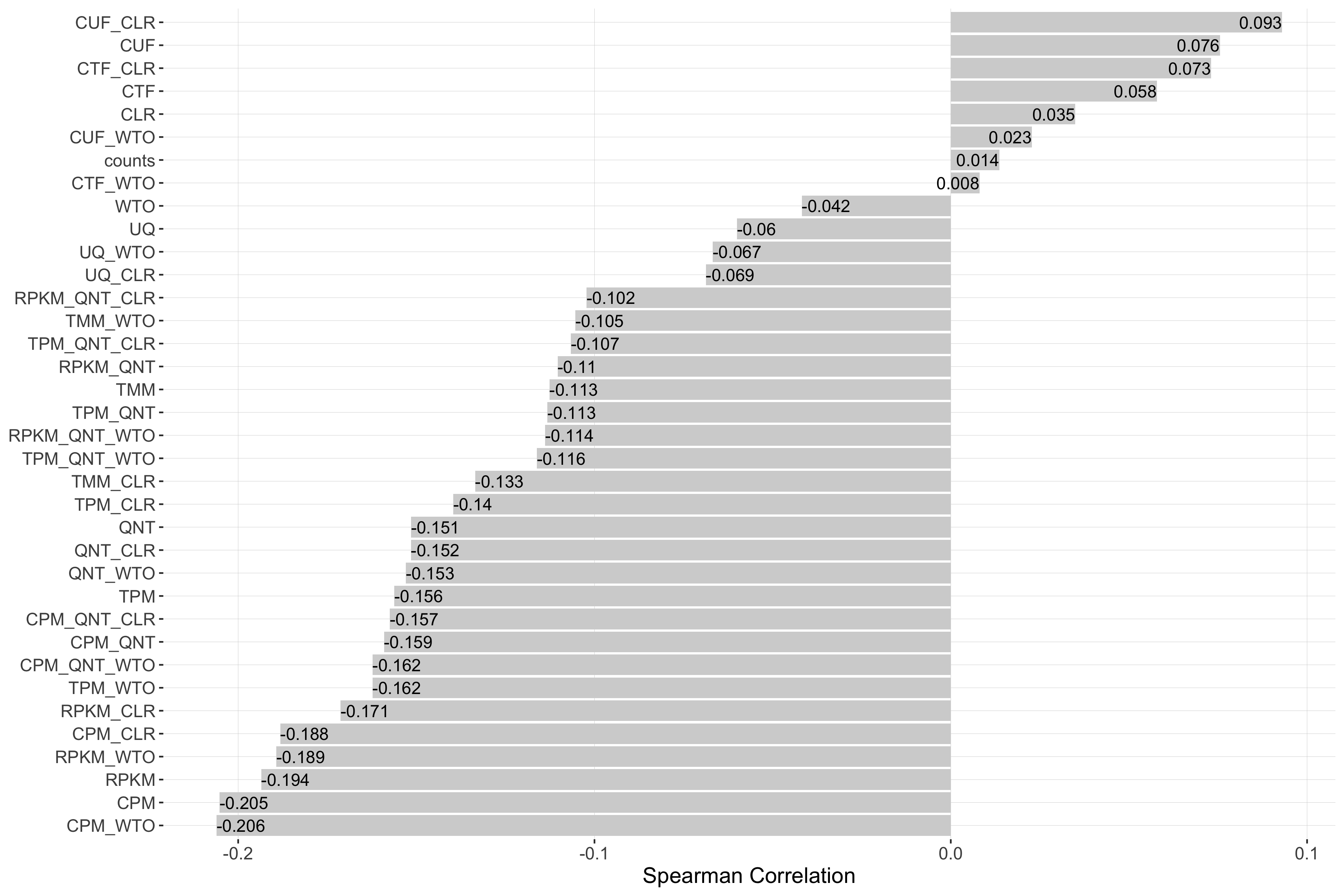
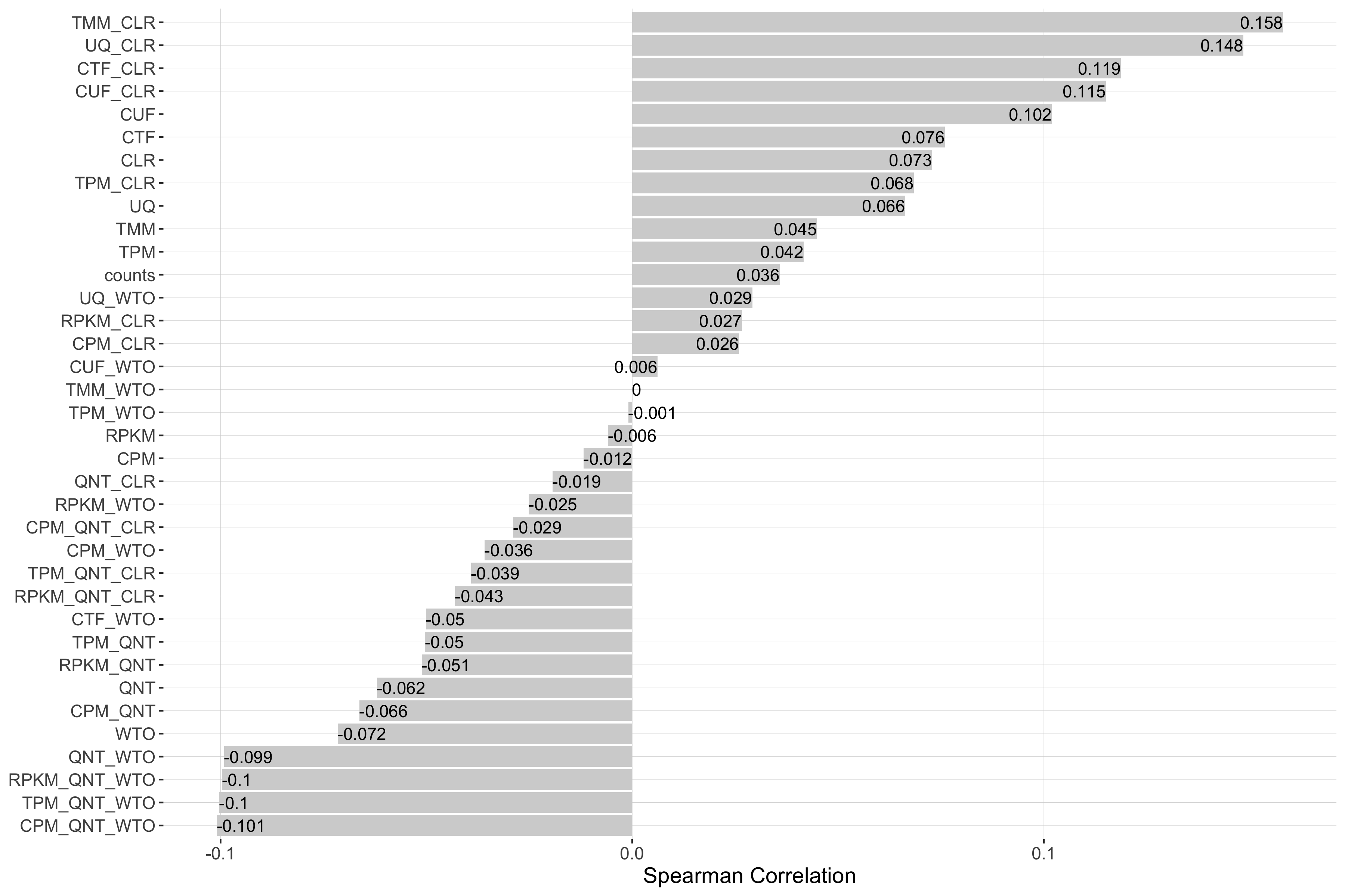
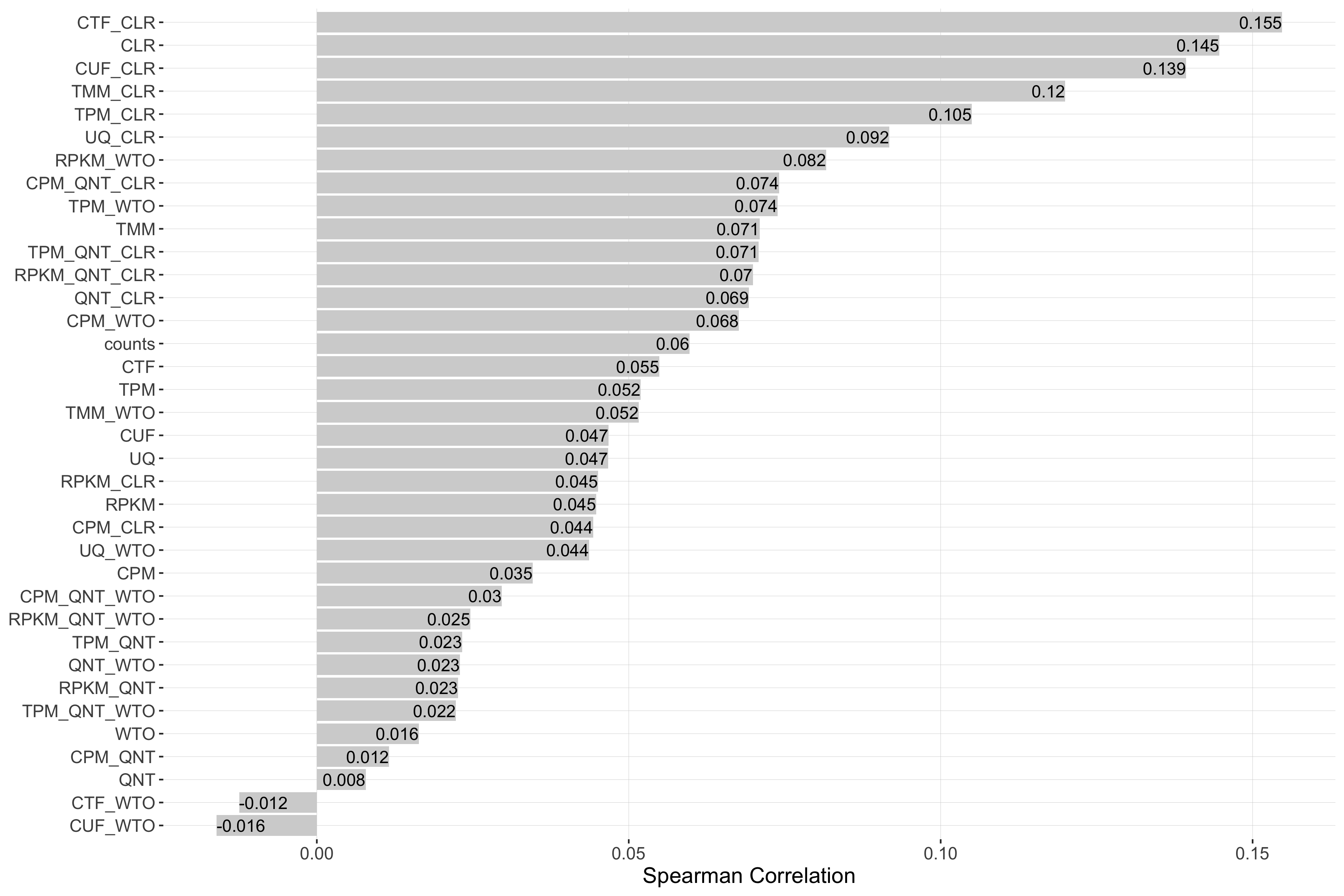
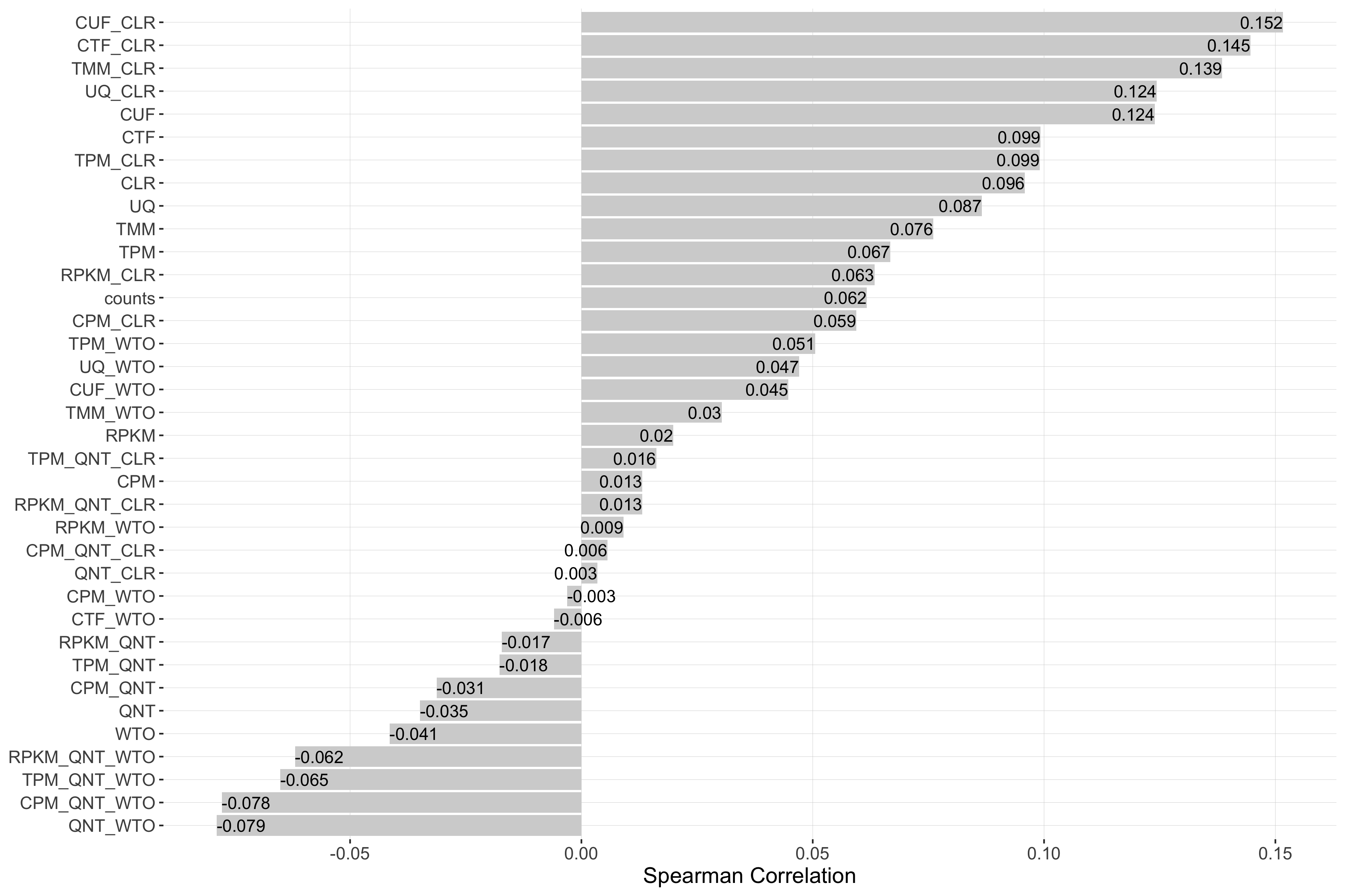
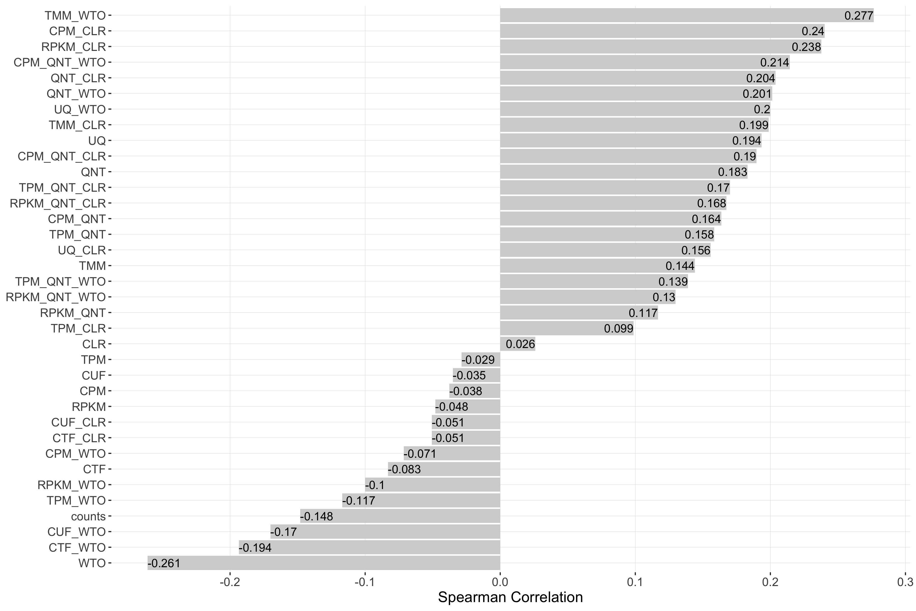
Impact of Sample Size
Sample size refers to the number of samples used to create a network. Each barplot shows the Spearman correlation of sample size and performance for each workflow.
log2(auPRC/prior)
Tissue-naive Standard
Tissue-aware Standard
auROC
Tissue-naive Standard
Tissue-aware Standard
log2(p20r/prior)
Tissue-naive Standard
Tissue-aware Standard
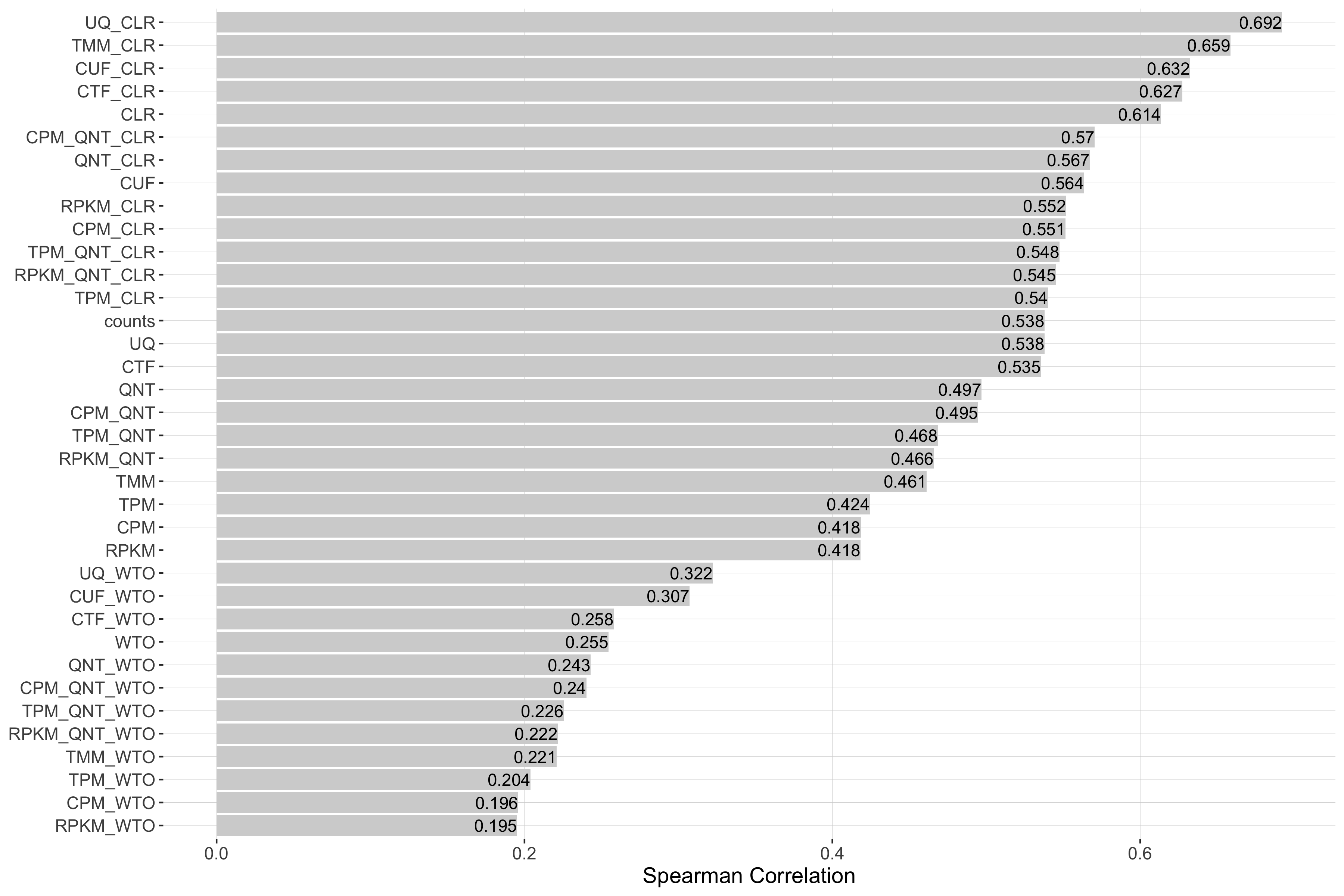
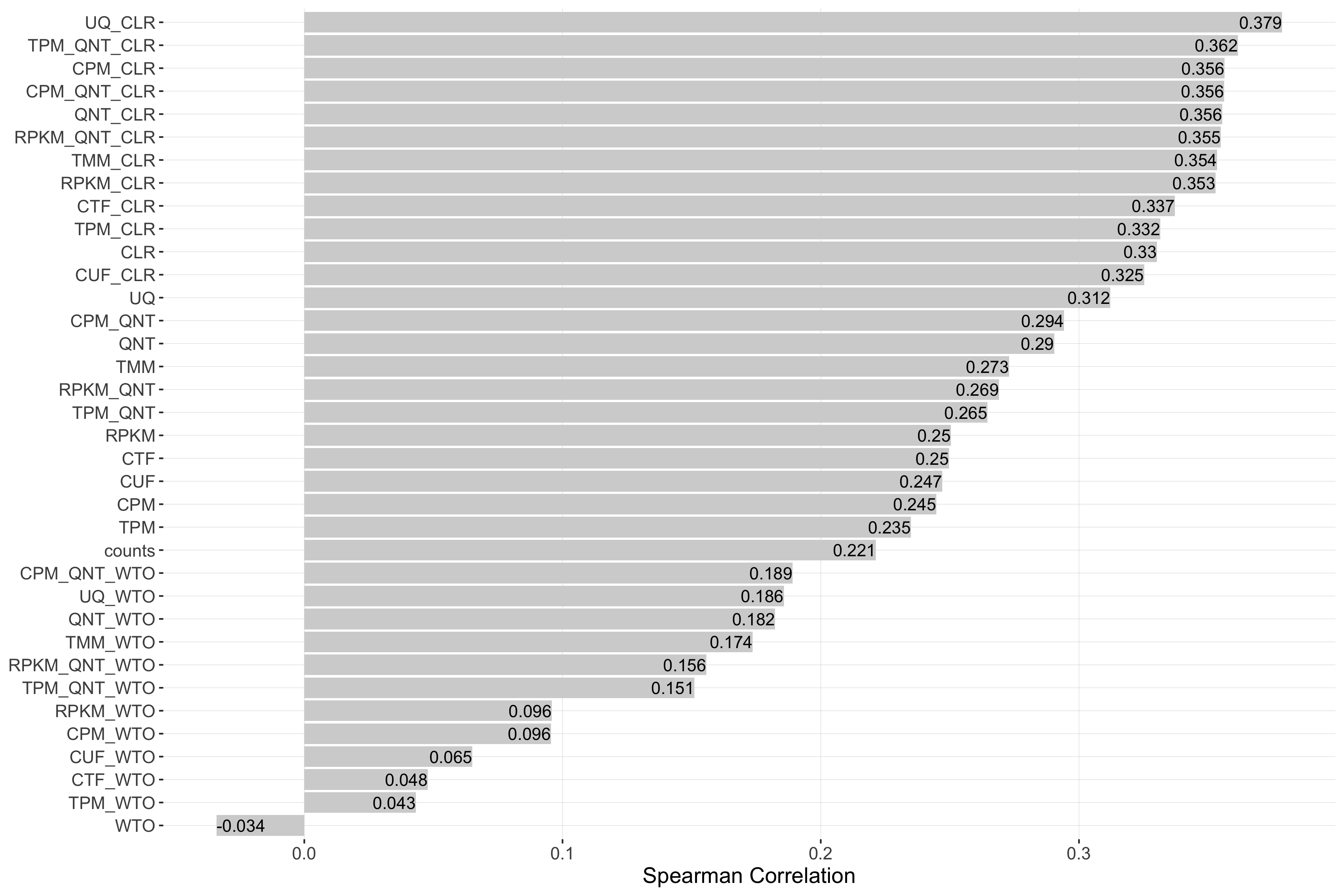
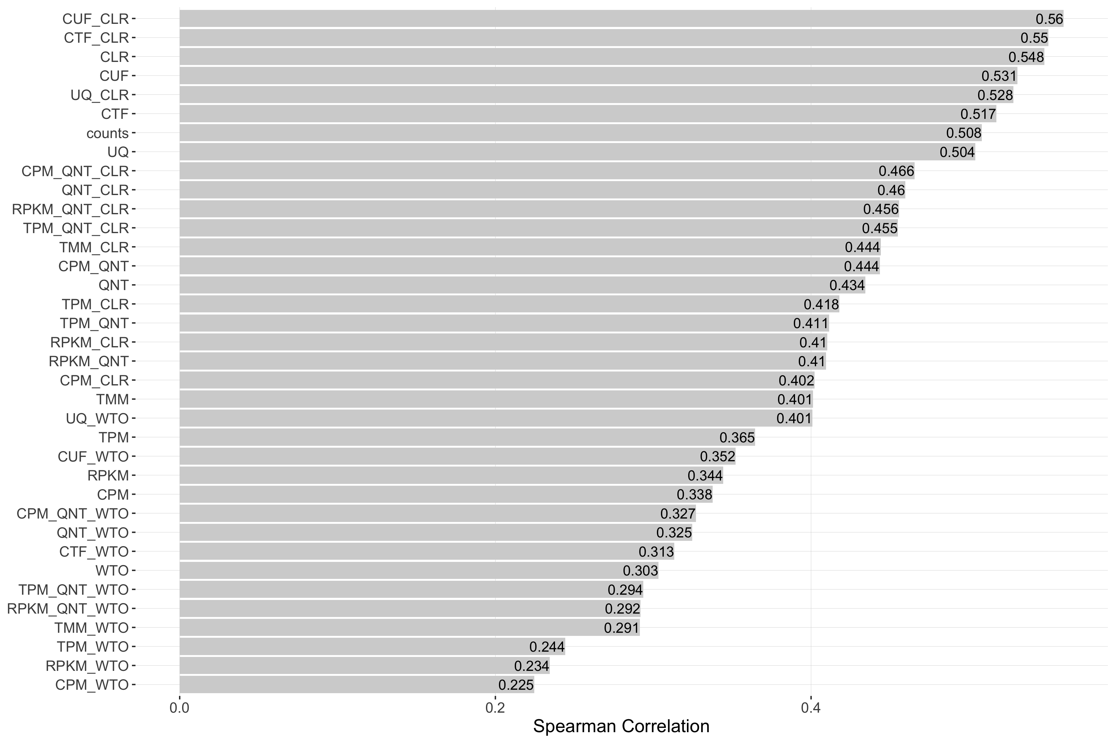
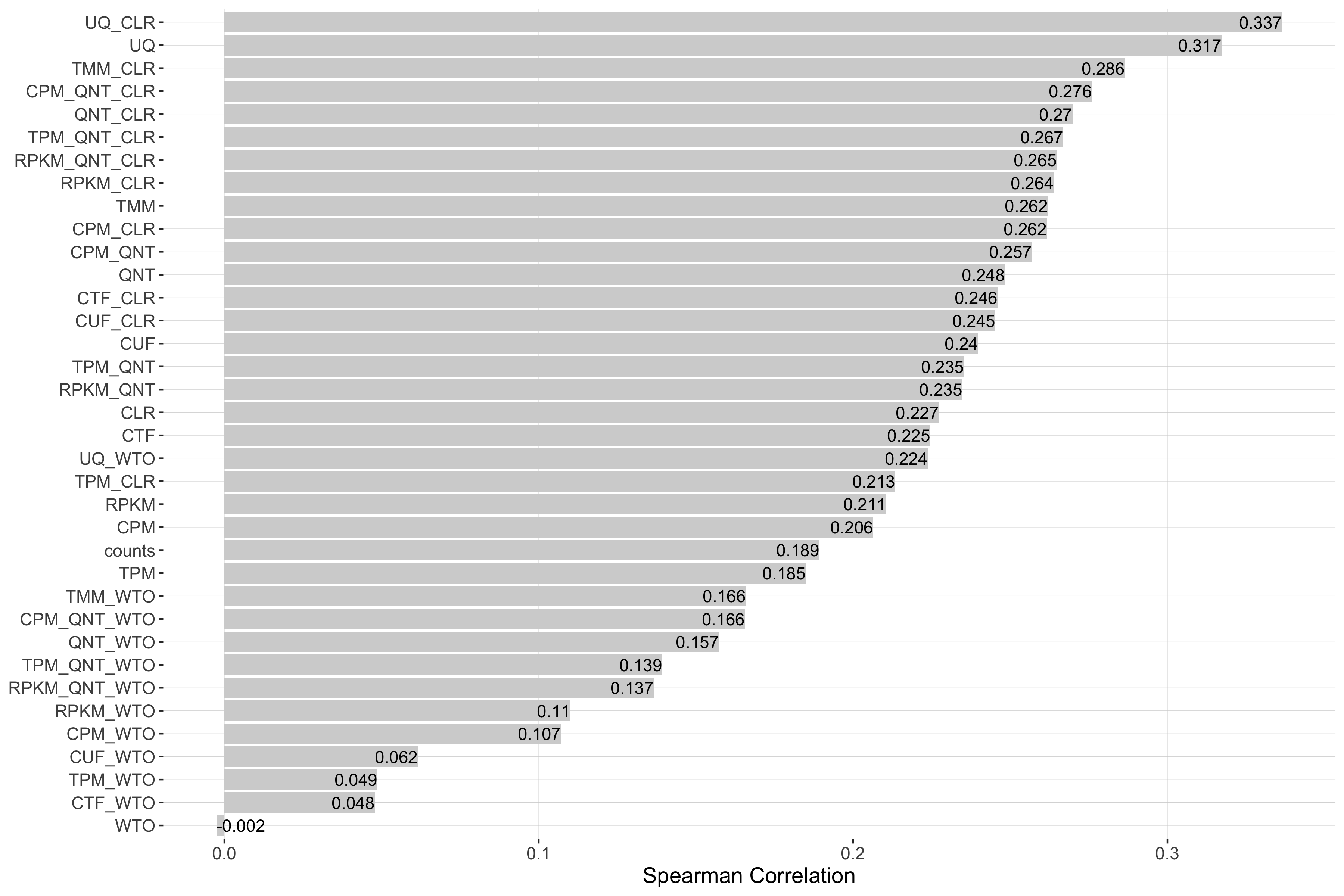
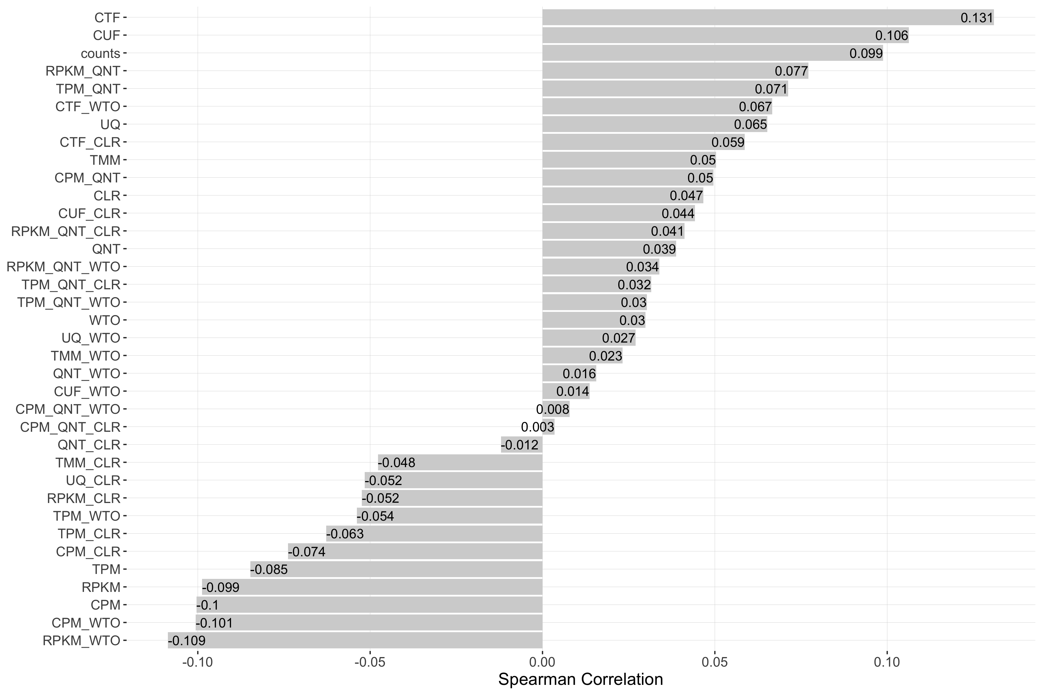
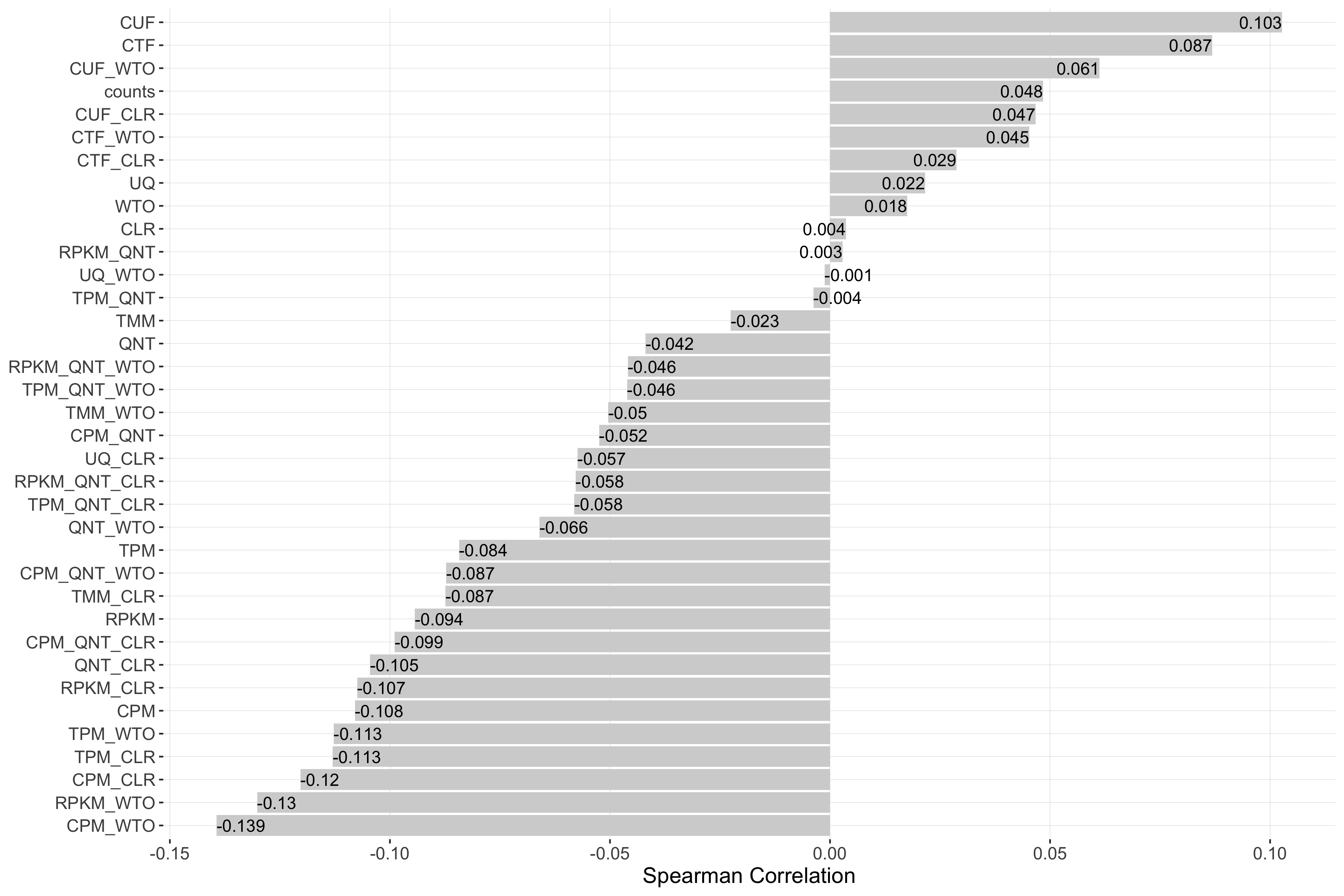
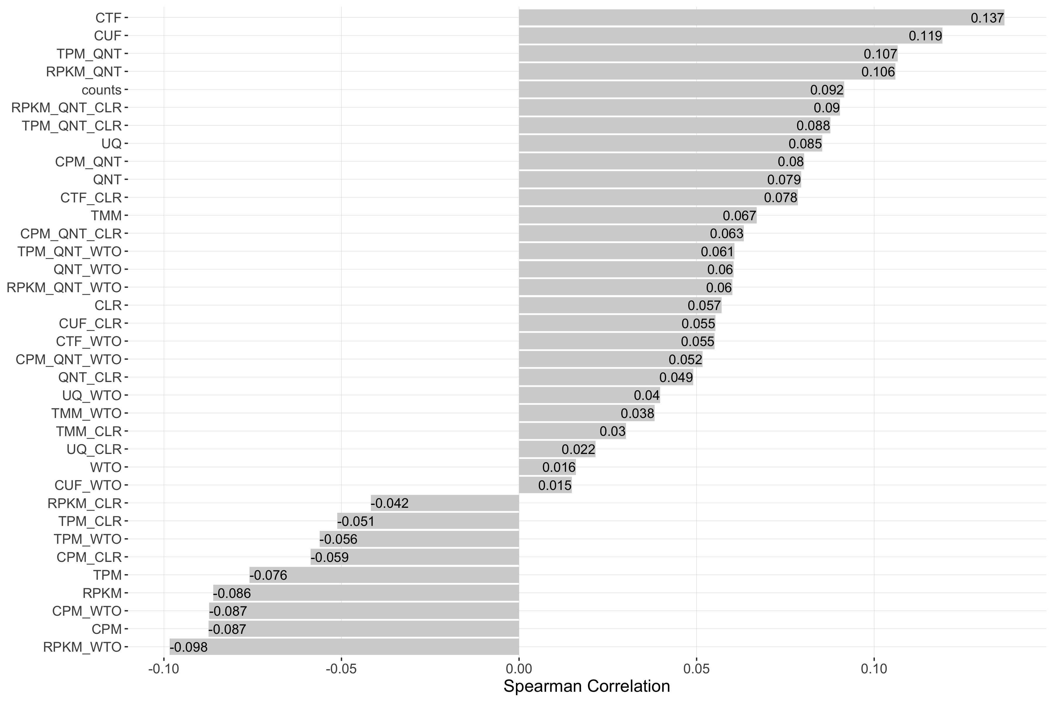
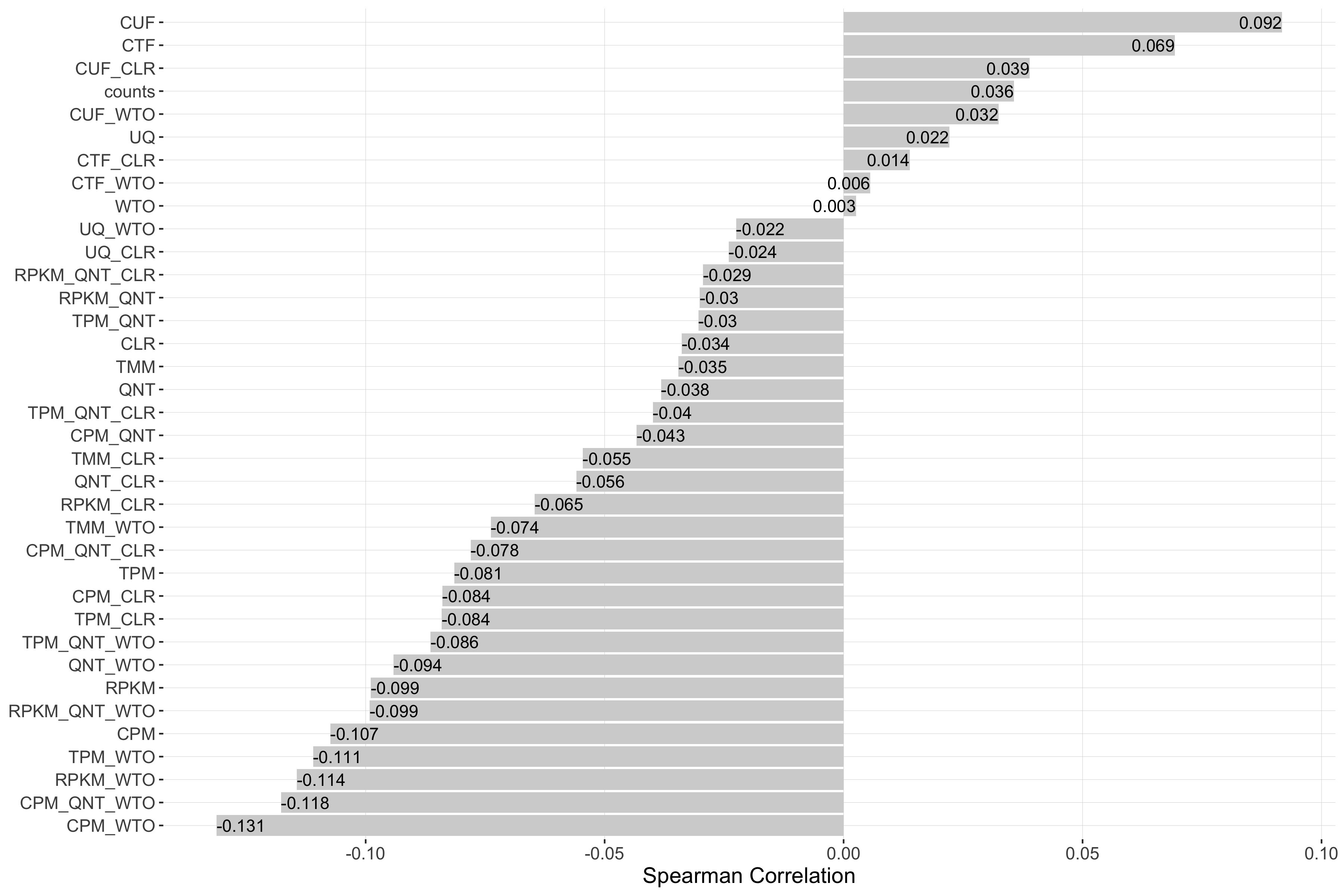
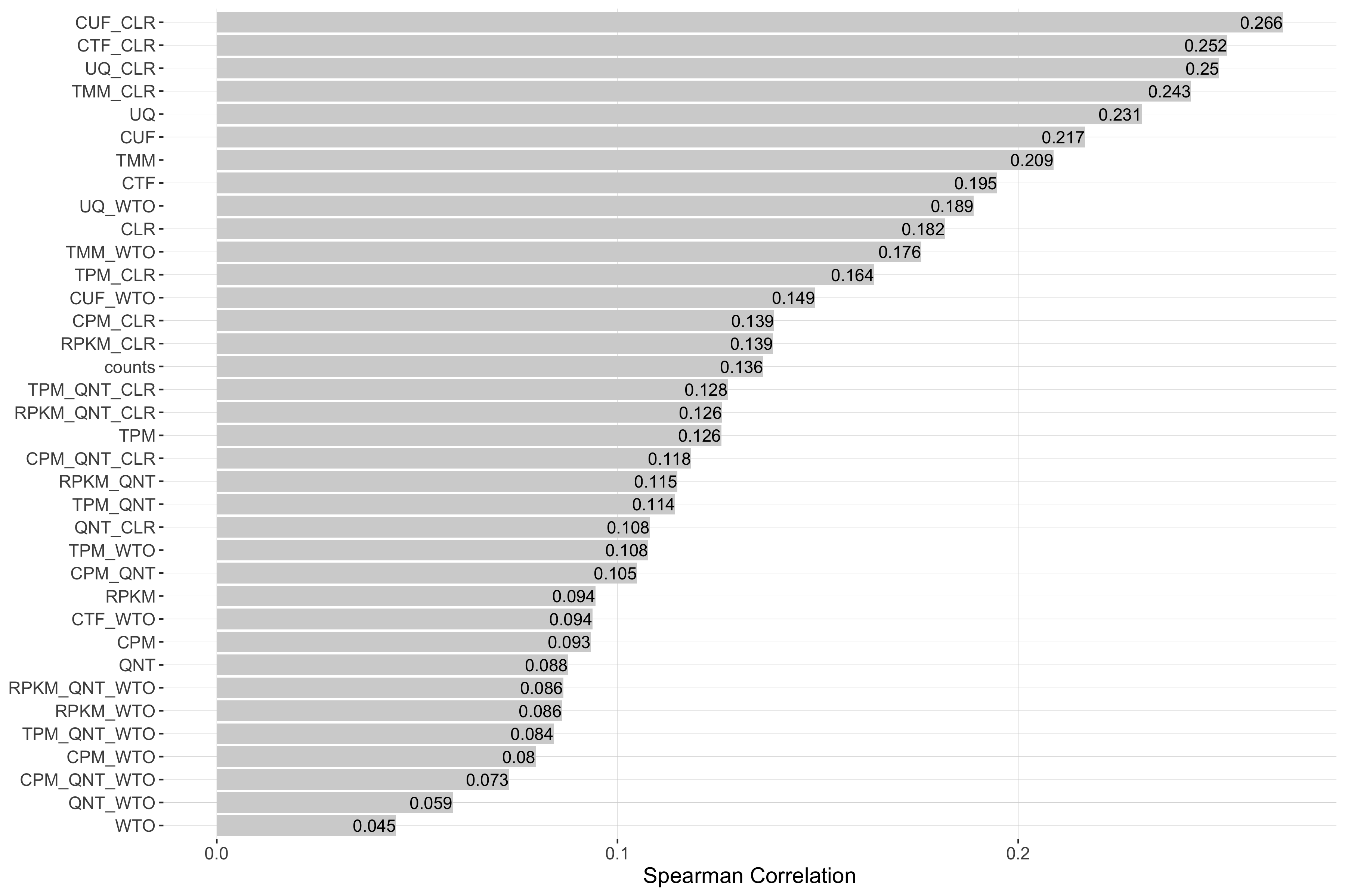
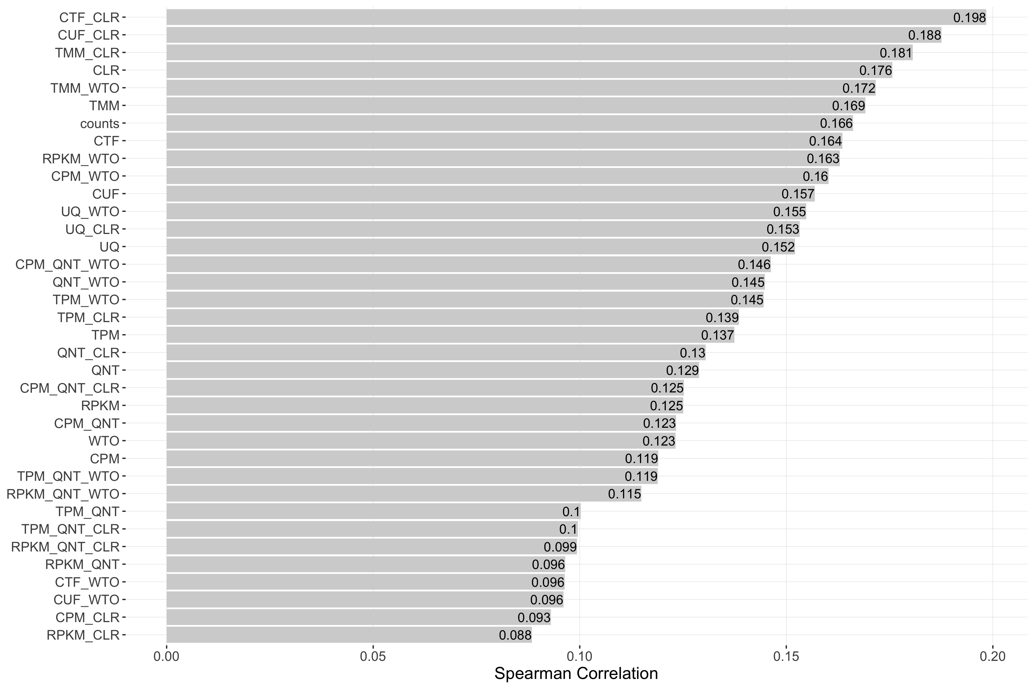
Impact of Sample Similarity
Sample similarity is determined by subsetting all samples to the 50% most variable genes in the experiment, then calculating the spearman correlation between all sample pairs in the experiment and taking the median value. Each barplot shows the Spearman correlation of sample similarity and performance for each workflow.
log2(auPRC/prior)
Tissue-naive Standard
Tissue-aware Standard
auROC
Tissue-naive Standard
Tissue-aware Standard
log2(p20r/prior)
Tissue-naive Standard
Tissue-aware Standard
Impact of Read Count Diversity
Read count diversity is calulated for a given experiment by taking the standard deviation of the sum of the counts in each sample. Each barplot shows the Spearman correlation of read count diversity and performance for each workflow.
log2(auPRC/prior)
Tissue-naive Standard
Tissue-aware Standard
auROC
Tissue-naive Standard
Tissue-aware Standard
log2(p20r/prior)
Tissue-naive Standard
Tissue-aware Standard
Impact of Tissue
Each point in the interactive scatterplots represents the median performance (y-axis) of each workflow (color of the point) in each tissue (x-axis).